sequoia behavioral health
A behavioral health brand with empathy at its core.
00
problem
Sequoia Behavioral Health was a new treatment facility entering a category where most websites feel either sterile or desperate. The people landing on the site are often in crisis, or love someone who is. Every design decision had to lower the barrier to asking for help, without ever feeling like a sales funnel.
solution
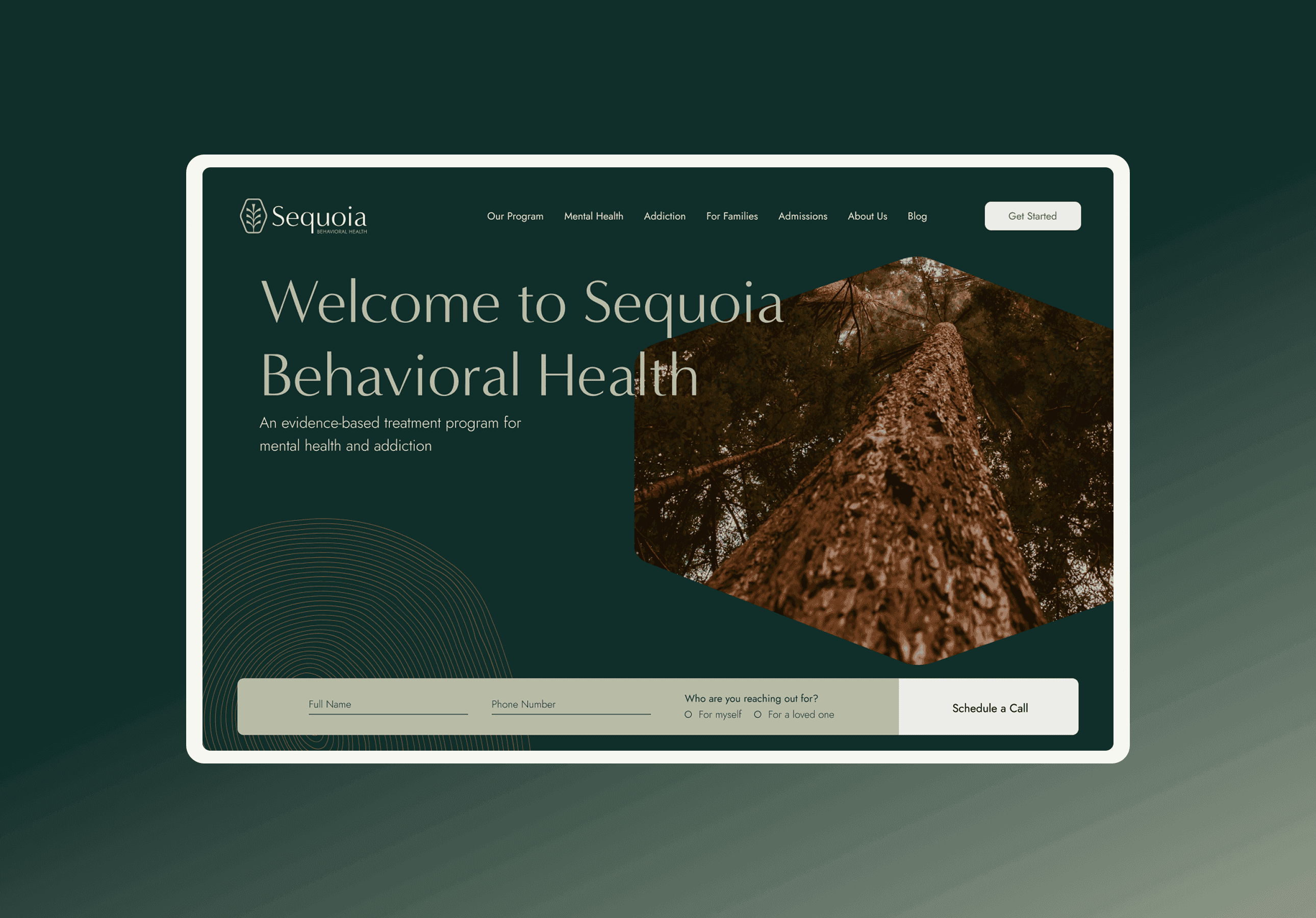
I directed the brand from the ground up and designed the full site around one job: making it easy to reach out. Warm, grounded identity, clear paths to contact from anywhere, resource pages that share considerate information before anyone feels pressure to ask. Empathy built into the information architecture itself.
The Starting Point
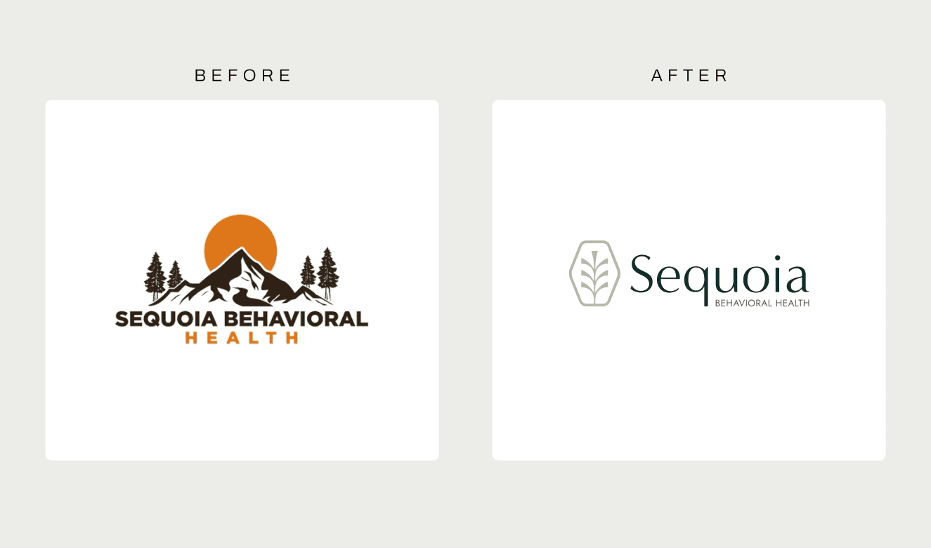
Sequoia Behavioral Health came to us with a logo they'd bought on Etsy... a template with their name dropped in. No judgment, it's what new businesses do. But a treatment facility asking people to trust them with the hardest moment of their lives needs a brand that was actually built for them. That logo became the clearest before/after for everything that followed.
Two Directions
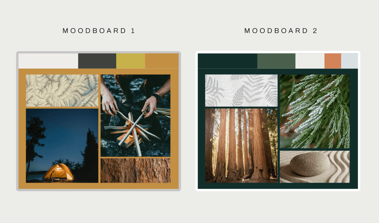
The first deliverable was a pair of moodboards. Sequoia knew they wanted something rooted in nature and trees, so both directions started outdoors and diverged from there. Option one leaned into camping, exploring, adventure... recovery as a journey you set out on. Option two went softer: nature as calm, restorative, closer to a spa than a trail. They chose the second, and it was the right call. The people arriving at this brand don't want to be challenged to an adventure. They want to exhale.
The Brand
From the chosen direction, the identity took shape: an earthy, grounded palette pulled from the moodboard's world... forest greens, warm neutrals... paired with typography that feels calm and credible rather than clinical. Every choice ran through the same filter: does this make someone in crisis feel safer, or more sold to?
The Site
The site's information architecture puts contact within reach from everywhere without ever cornering anyone. Resource and treatment pages give real information first... what conditions look like, what treatment involves, what to expect... so a family researching at 2am gets answers, and the ask-for-help moment stays available but never forced.
The Outcome
Sequoia grew fast. They're nearly 5 stars with hundreds of Google reviews, they're Joint Commission accredited, and they've opened more locations. The resource pages ended up being the SEO engine... people find them by searching the exact questions those pages answer. The site did what it was built to do and more: supported people and their loved ones in getting the help they need.
role
healthcare, mental health
industry
creative director, lead senior web designer
collaboration
eightfold technology
category
Web Design, Branding
01

02

03

04

05

06